Link Home
Link Home helps young adults find rental accommodation more efficiently and with greater reliability by offering landlord reviews and neighbourhood information alongside property listings

Project Overview
Project type: BrainStation Capstone Project
Timeline: 10 weeks, Jun-Aug 2021
Roles: UX Researcher, UX/UI Designer, Marketing Strategist
My key learnings

1. Trendy designs and abundant effects are not always the solution for good designs
Inspired by glass morphism style, I designed the first prototype Style 1. However, 70% of target users prefer the simple design prototype Style 2. Their feedback is the glass morphism style is distractive and unclear to navigate.

2. Set up a clear colour Hierarchy and get request feedback are important.
My “Color Inject Test 2” with unclear colour hierarchy confuses the users as the differentiate between color is not strong. I also should test and receive feedback frequently and don’t create the whole user flow
3. Always learn and optimize new functions
My project ends 2 days before Figma launched their new functions. I quickly learn them and applied to my last website prototype.
By using the new Figma Variables and modes, I reduce the large amount of frames and manual prototypes for the marketing website.
My Approach
I followed the double diamond design framework during this project, with an additional three stages that focused on the go-to market strategy.

Research and Discovery
Problem Space
Prospective tenants are dealing with increasing fraudulent advertising that may cause them financial harm.
The rent for new tenants has risen significantly which has resulted in a surge in the number of rental scams by 15% and a significant increase in the frequency of faulty advertisements by 43%, as per the latest report by Canada Mortgage and Housing Corporation.
15% increase in
rental scam
43% increase in
faulty advertisements
Challenge in finding suitable rental properties
Challenge in verifying the listings credibility
Existing platforms primarily serve landlords and real estate brokers, offering limited information to tenants
This lack of transparency creates a significant challenge for tenants in making informed decisions, verifying the credibility of the listing and finding suitable rental properties.
Millennials, aged 25 to 40 years old, are heavily impacted as they represent the largest share of renters, accounting for 32.6%. This group will be might target audience and users.
Primary Research
To understand how my target users experience the rental process, I conducted five 30-minute interviews with adults
-
Aged 20 to 40 years old.
-
Are renting rooms /houses
-
Using an online platform to search for rental places
-
Living in Canada.
I asked participants questions about the process:
-
searching
-
contacting landlords
-
scheduling in-person meetings
-
closing the deal.

I analyzed the interview notes for each participant, extracted quotes, and classified them under three categories:
-
Behaviors
-
Motivations
-
Pain points
With this categorization, I extracted three themes that provided me with insights into the problem space. After reviewing each theme, I chose one core insight to move forward with my solution.

Synthesis
How might we statement
At this stage, I refined my design challenge to align with the insights I had gathered from my target market. I aimed to address the pain points related to missing information and the lack of credibility in property listings. These two factors are crucial for helping target users find their perfect rental properties
How might we help prospective tenants in Canada from the age of 20-40 to have access to relevant and accurate information when renting a new home
so that they can avoid faulty rental advertisements and make an informed decision?
User Persona & Experience Map
Empathizing
To synthesize my research findings, I developed a user persona profile and user experience map. These tools helped me keep the target user in front of my mind, and weigh my design decisions against the research insights.

To create my user’s experience map, I explored what the process of searching for a new rental place for Alex looks like. In the process, I stepped in Alex's shoes, broke down her regular process, and waged the value for interventions in different areas

Getting ready to ideate
After conducting user mapping, I gathered more information to move to the next step:
1. What's the problem ( missing information about landlords 'credibility, neighbourhood)
2. What's my goal ( increase the information about landlords and neighbourhoods in the listing)
3. How to address it ( consolidate information and
Ideation
Core Epic
Authoring stories
To guide the ideation process, I authored different user stories from the perspective of Alex Andreson using the following structure:
“As a [user type] I want to [desired action] so that [I benefit]”
-
Expanded Alex experience map with 32 user stories that identified desired behaviours and outcomes.
-
Grouped the 32 stories under 4 epics to find similarities and prioritize their relevance.
-
Chose 1 epic to start developing my user task flow.


I chose the epic “ I want to search for properties that have high credibility ” because it aligned the best with the problem space. The epic touches on the need of my target user to search rental properties with comprehensive information about rents, policy and neighbourhood information
User Task flow
Develop User's Task Flow
Alex uses Link Home app to search for her new rental place including these steps:
-
Apply a set of detailed filters to narrow down her search.
-
View the landlord's profile, and read reviews.
-
View information about the neighbourhood.
-
Contact landlord.
Epic: Property Search Process
User Story: As a tenant, I want to search for a rental property to relocate to Toronto for my new job.
Assumption: I have created my profile on the app and am now searching for a rental property that meets my requirements.
Task: Find a suitable property and contact the landlord.


Wireframe & Prototype
Inspiration Board and Paper Sketches
I used this inspiration board as a guide to sketch out solutions on pen and paper for my initial concept screens.
I create 4 sketch versions for each page and then determine which one serves as the final solution sketch.
Exploration Sketches
Solution Sketches
Home Page
Users can search by 2 ways : By filter or quick search by clicking the icon


Cards with a horizontal scroll can show users more listing options
Filter Page


Result Page
Lanlord Profile Page

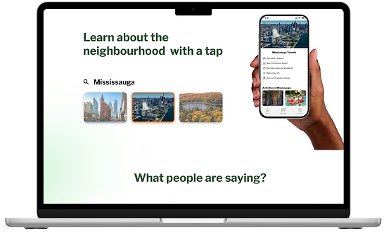
Neighborhood Page


The filters are displayed as a list so the users can scroll vertically
Users can quickly choose their property type by selecting the icon
A slider is easier to use than typing the value
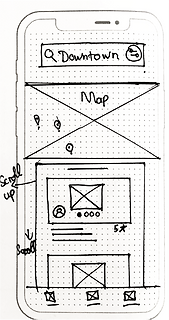
Users can adjust the filters by clicking the search bar
Users can use the map to search for the results

The list with the combination of icon makes it easier to read
The chips show the most reviewed adjective about this landlord. Tenant can understand quickly the landlords.

The list with the combination of icon makes it easier to read
A list of activities around the neighborhood so tenants can understand the lifestyle of this area
From the sketches, I assembled grayscale wireframes and created a functional prototype for user testing.
The objective for this phase was to engage in a quick user-centred iteration process to challenge my assumptions before moving into UI design.

User Testing
Conduct User Testing to Revise the Prototype
I conducted 2 rounds of usability tests with 5 different participants each round. The user feedback tested my assumptions about User accessibility, Information architecture and Flow.
The users performed 5 tasks in real-time, speaking out loud, and offering their thoughts on the concept:
-
Search for a rental place neighbourhood
-
Apply all required filters
-
Go to the Landlord's profile and the neighbourhood page
-
Message the landlord
-
Check messages in the past with other landlords
I recorded their interactions with different parts of the prototype, weighing them against the completion of each task and their understanding of the application.

After each round of testing, I analyzed the outputs by condensing my notes into action points on a prioritization matrix. Overall, I iterated through 3 prototypes and addressed 3 major issues.
Issue #1 - User didn't notice location selection in the filter page
Version 1
Version 1

Final Version

The reason users overlooked the location field is the lack of proper organization in the filter list.
I added dividers in the Filters list for better organization and clarity.
Issue #2 - Result cards didn't look like they are clickable
Version 1

Final version

I added a colour for the cards and a shadow effect to create a clear colour hierarchy and enhance visual distinction.
Issue #3 - Color Hirachy is inconsistent
The users have issues finding the “Search bar” or “Location Filter” because the colour hierarchy is not consistent.

Version 1


Final version


I adjust color purposes and add more colours in the hirachy
Revised Mid- Fi Prototype

After the final round of iterations I had a grayscale prototype that was backed with extensive secondary and primary research. It was time to start building a brand identity through UI and a high fidelity prototype.
Building the Brand
Keywords
What identifies my brand
I brainstormed a set of keywords that identified my brand’s personality. Then, I grouped the terms into themes that embodied the brand identity. Below are each of the themes and keywords:
Empathy
Realistic
Minimalistic
Connected
Clean
Fresh
Mood Board, Color Palette, and Typography
I created my mood board using gray and beige as neutral colors, while incorporating green and orange to represent the brand.
All the pictures share the same characteristics of simplicity, calmness, and cleanliness.
For the font, I chose a sans-serif typeface as it complements the overall modern and minimalist aesthetic of the brand


App Name and Wordmark
I generated a list of possible names that align with the mission of the app, which is to help tenants and landlords connect with each other using realistic and accurate information.
I wanted the name to include the word 'Home' or 'House' so that the purpose of the app is clear and transparent from its name.
Rent Ease
House Match
Home Seeker
Find My Home
Rent Link
Home Link
Home Link
I decided to use the name "Home Link" because it effectively captures the essence of the app, emphasizing the connection between tenants and landlords
I sketched different styles that incorporated the 'Link' symbol along with a house symbol.


I chose the fourth option because it embraces the character of the brand, which is nature-oriented, earthy, and minimalist.
Final Logo design


Color injection & Accessibility test
I used colors extracted from the mood board and tested different versions to ensure the best accessibility and user-friendliness

Both shades of green and orange were too strong, creating high contrast and distractions for users as both colours competed for their attention

This version design lacked an anchor, as the absence of the orange colour made it feel less balanced and cohesive

This design has the most balance between green and orange.
From this design, I determined my primary and secondary colors for hi-fi design.
Different shades of green will indicate selected, and unselected stages of different chips, buttons, and bars in the app.
Orange will be used to indicate the current stage in the status bar, Notification and CTA button.
High Fidelity Prototype

Expanding the Brand
For our go-to-market strategy, I developed a responsive website to help communicate our value to prospective users.
The design process involved
-
gathering UI inspiration,
-
creating sketches,
-
doing multiple rounds of design iterations in grayscale wireframes.
-
creating low-fidelity design
-
creating high-fidelity prototype
I employed a similar strategy as with the design of the mobile app, such as doing rounds of user testing to find friction points.
